Telling a different mountain bike story
Client: Eskapee
Year: 2016
What we did: Discovery, brand naming, brand strategy, identity design, UX/UI design.
Background
A highly respected mountain bike photographer, came to us because they wanted to build something new, something that told a story how they saw it. They were fed up seeing the developing narratives around mountain biking (MTB). They saw another story, a real story, an alternate story to that being portrayed.
Solution
Our human-centred approach began with empathy development, to truly understand the problem. This guided our thinking to develop insights that guided the brand strategy, identity design, UI/UX design and content direction. We wanted to truly understand the problem before we asked what it looked like.
We discovered, that the current MTB media landscape was in a state of misrepresentation. It had become ok to exploit, contributors were not being payed for content creation. The perception of cash for comment, creating lack of integrity, the everything is awesome effect. A lack of originality and creativity, simply sharing content rather than creating, all adding to the digital noise. Content with a time limit, because you can’t feature a story with last years bike in photos. Beyond the bike, nothing was being said, important human issues were ignored, but these were talked about at the trail head.
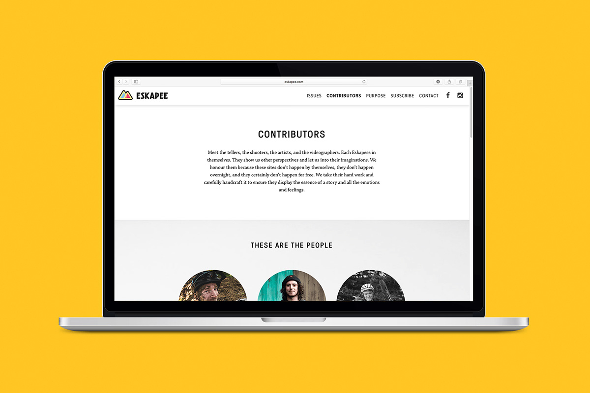
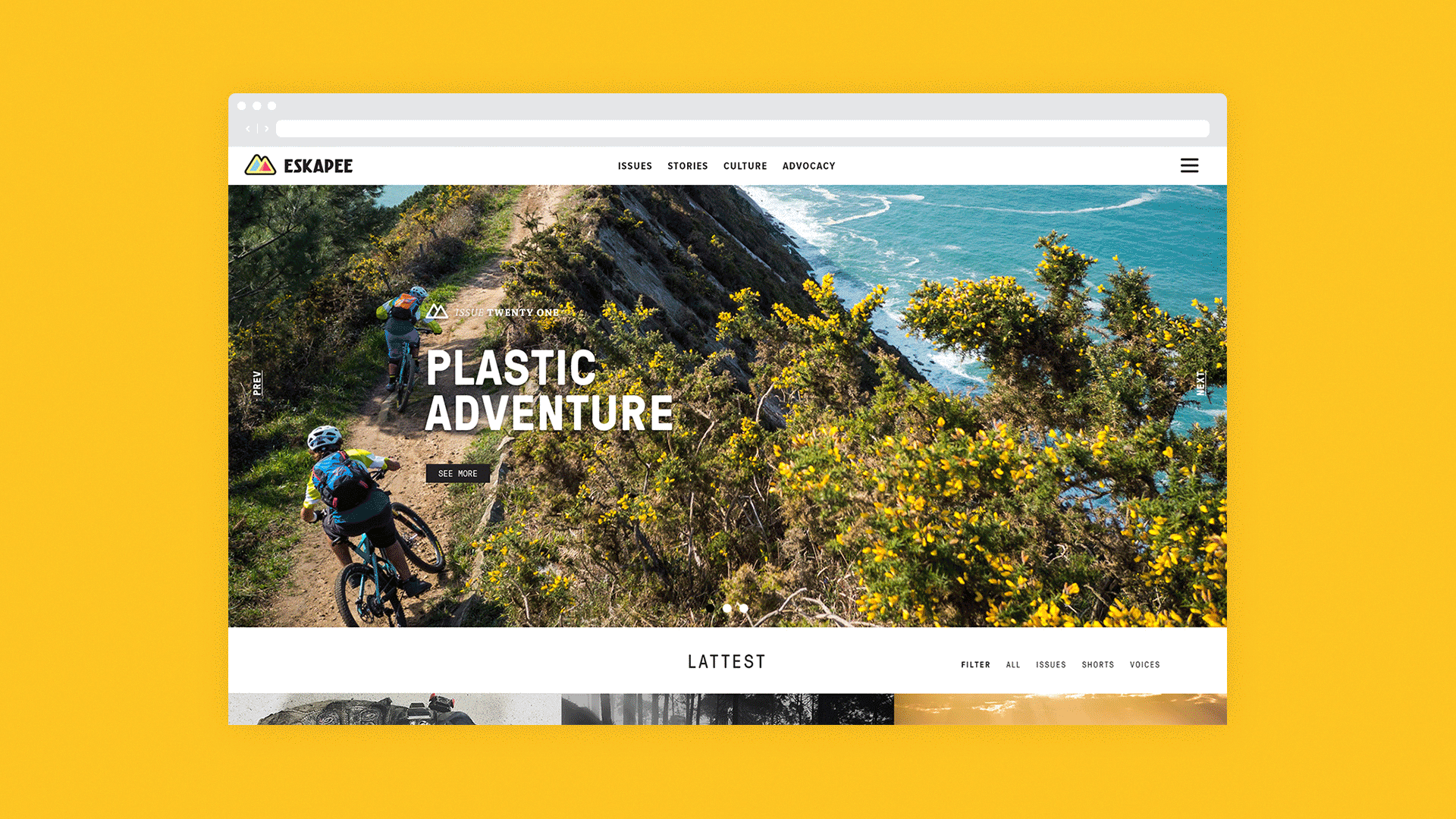
We started with a name that encapsulates everything we are trying to achieve. ESKAPEE. It represents the action of why people ride and the alternate way the brand tells the mountain bike story. It’s about escaping from the mundane, the expected, and the exploited. It’s inviting, it asks people to join, to become Eskapees, and to seek the alternate. Eskapee answers the questions learned from the discovery process. They pay contributors fairly, content is 100% original, content is timeless, they address human issues mountain bikers face.
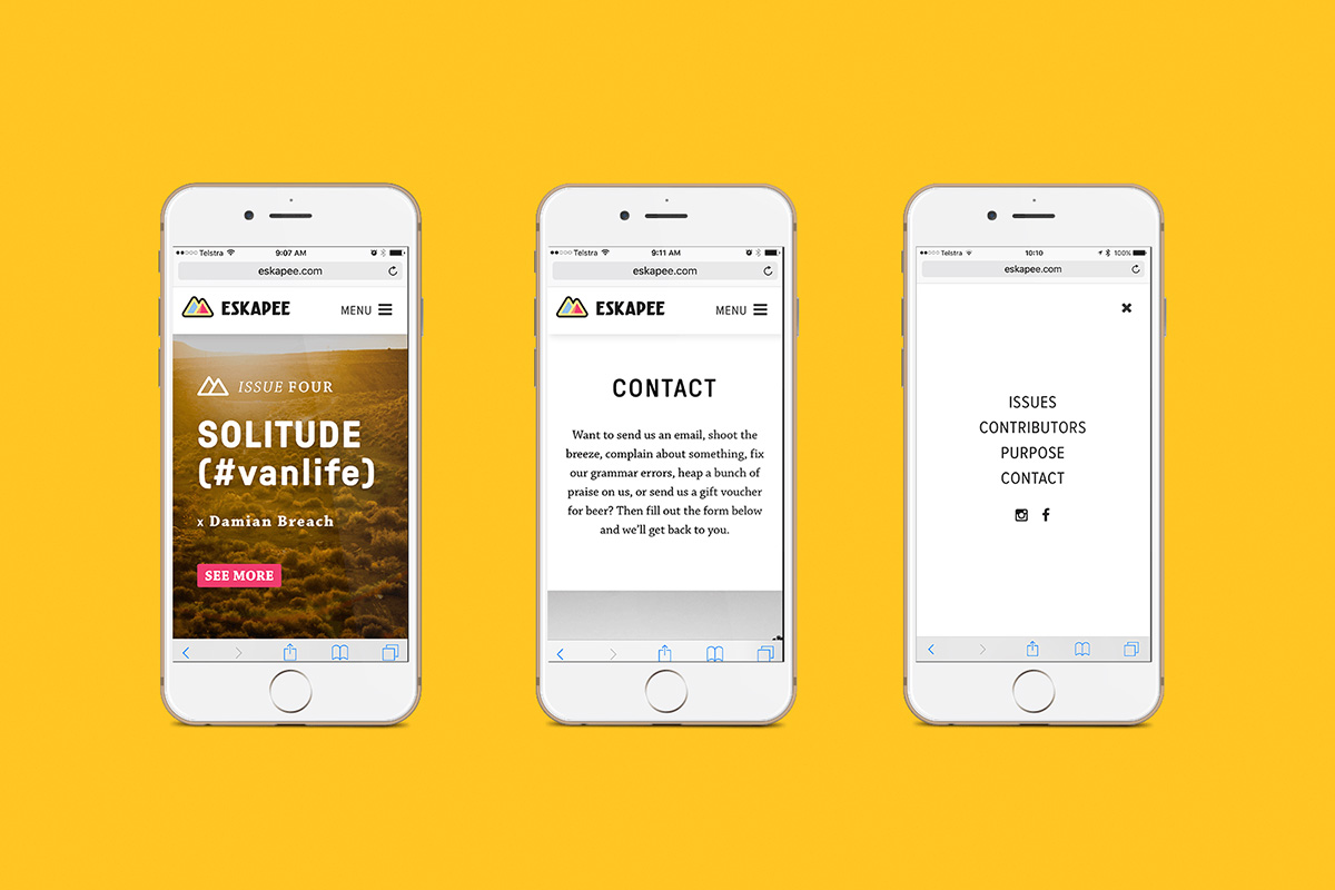
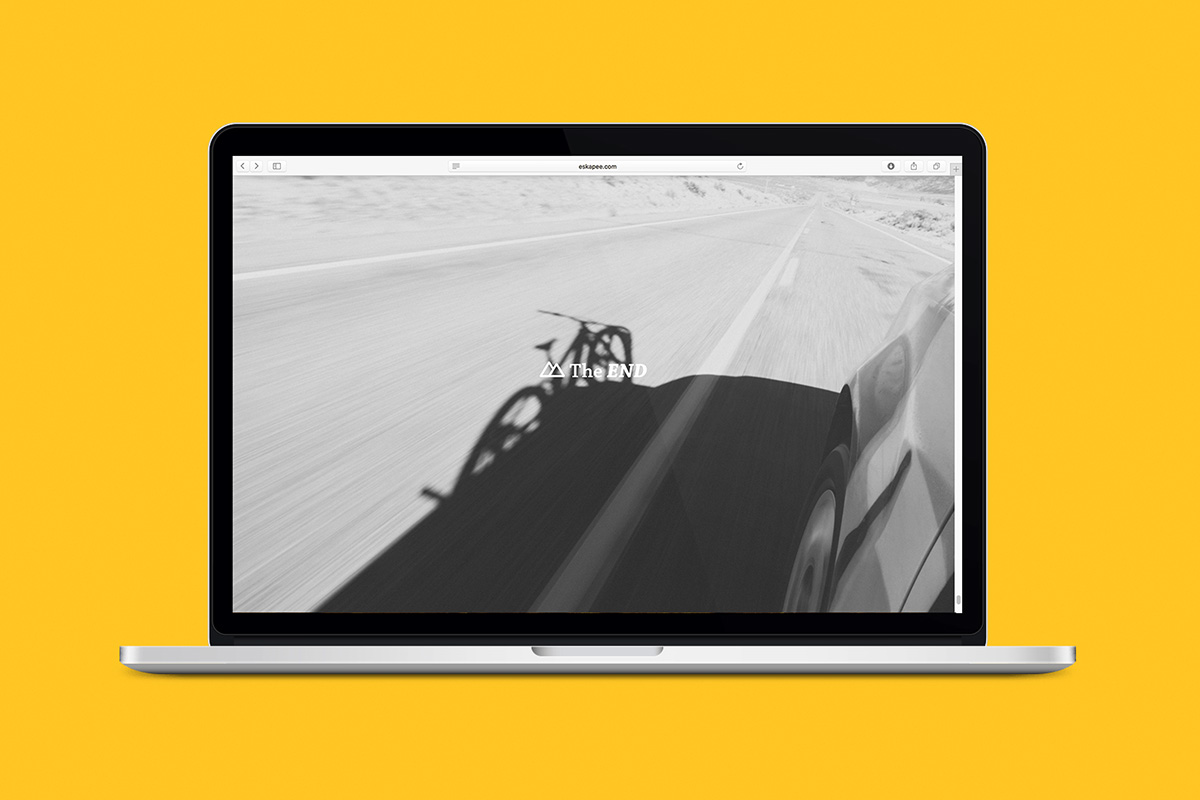
A simple visual language was created to tell this story. An unobtrusive design approach, that strived for communication over decoration. The logo represents the spiritual home of mountain bikes.
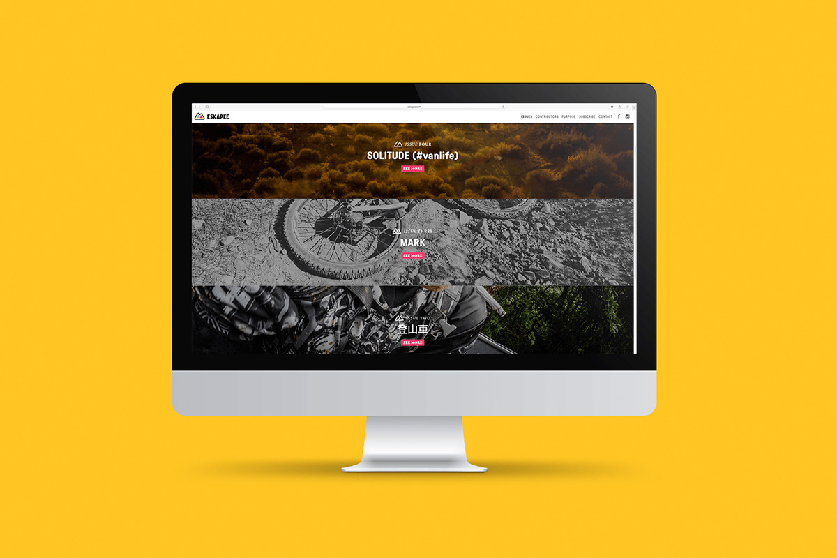
The content strategy helps to avoid digital noise. Main features launching monthly, shorts weekly. Keeps thing simple and enforced the brand strategy.
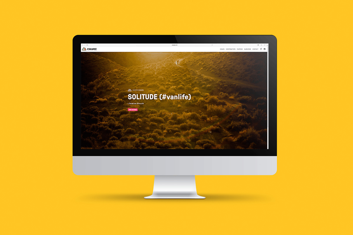
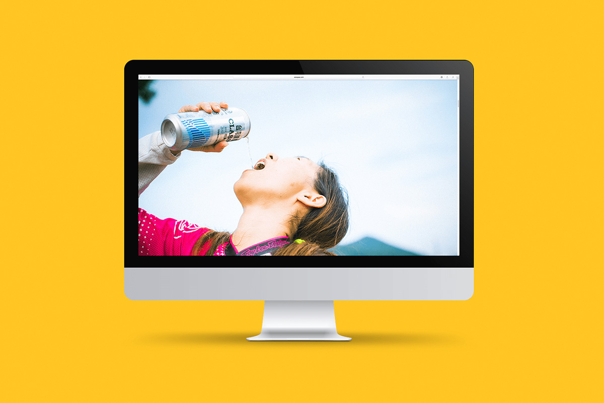
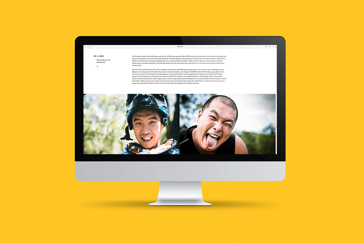
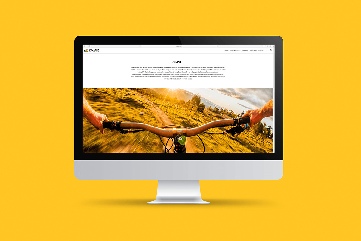
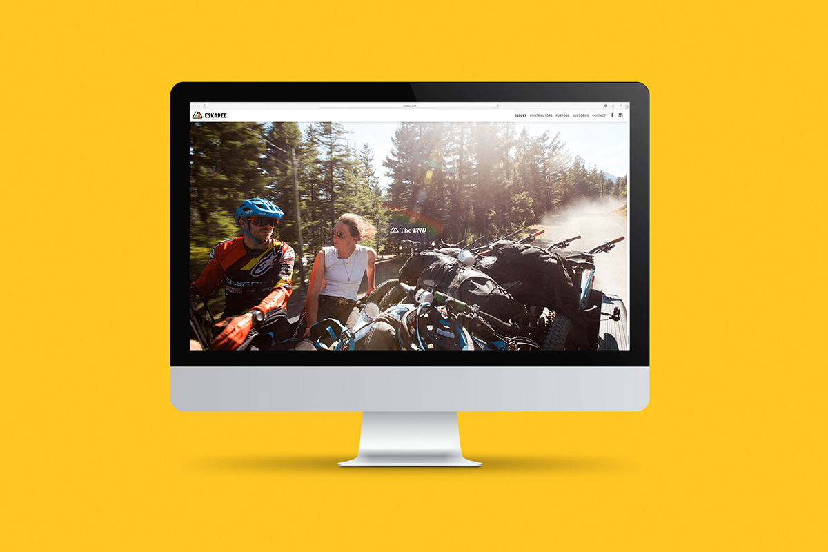
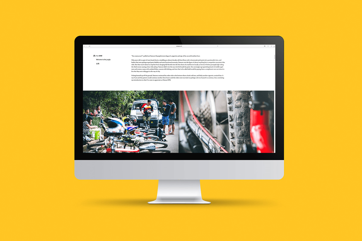
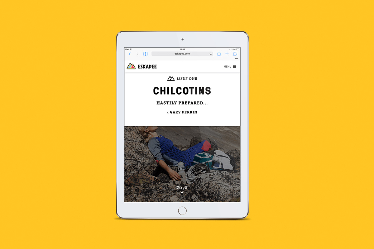
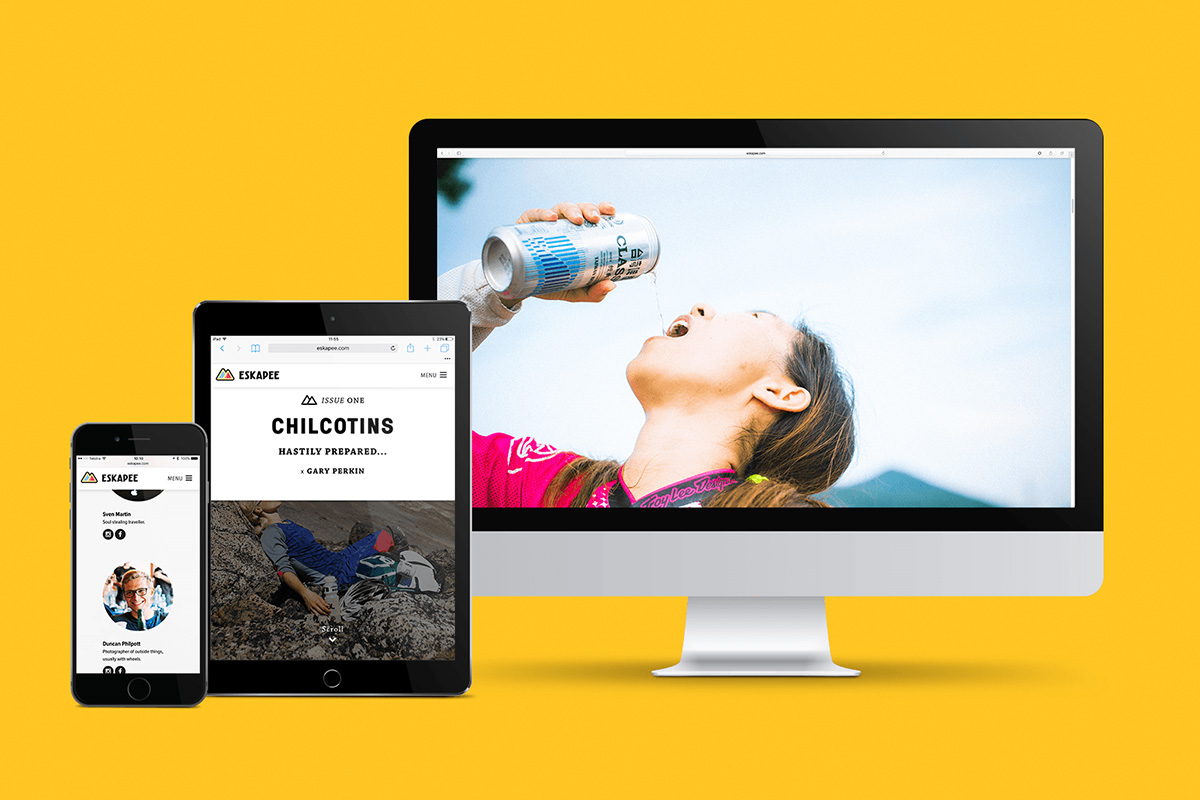
The website UI/UX has been influenced by the things learned in the empathy development process. Its clean, clear and lets the content be the hero. The design further enforces the unobtrusive design approach. Images are full screen, and paragraph lengths are easy to read.
It’s the understanding that the small moments of the brand combine to create the something larger.
Branding Graphic Design Website